
Before reaching for a calculator, we should always first apply common sense. Our calculator may be very sophisticated and expensive. We may be itching to plug some data in, to see what our calculator can produce. Who knows, our calculator may by chance, find a cure for COVID-19.
There is no shortage of people calculating increasingly complex control charts for COVID-19, in the hope they will achieve something. They never stop to think just what they hope to achieve.
Common sense should be the first priority.
The first step is to ask, what are you trying to achieve? Professor Deming wanted to know if processes he was studying were running at their maximum potential. He also asked whether these processes would continue to run at their maximum potential into the future. The tool he chose was the Shewhart Chart.
Professor Deming did not need sophisticated computers to answer his questions. His Shewhart Chart was simple, calculated using average ranges. He did not torture and obscure his data by attempting to normalize it. Professor Deming relied on Dr Shewart's assertion (later proved by Dr Wheeler), that this was not only not necessary, but should never be done. Professor Deming answered his questions by keeping it simple. It was simple enough for any operator, with a piece of paper.
Endless folk try to draw control charts over COVID-19 data in the hope it will answer some question that they have not asked. They do not apply common sense. They do not ask a question as Professor Deming did.
We know that if one person gets infected, he/she may infect others. The numbers of infected people will increase. At some point the numbers will decrease. The numbers may go back up again. The number of people being infected depends on the number already infected.
There is no question for a control chart to answer for infections data. All that a control chart can show, is that the data is indeed non-homogeneous. We already know the data is non-homogeneous, because we know how infections spread.
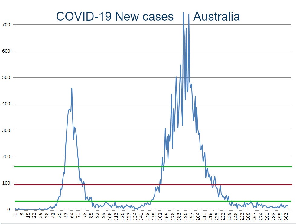
Control charts have no benefit for COVID-19 data. They tell us nothing. They answer no question. Even a moment's reflection of the graph above for new COVID-19 cases in Australia, should highlight the futility of even attempting to contort a fit of a control chart.
Control charts are ideal for bringing a process to its full potential and ensuring good quality into the future. They are worthless for COVID-19 data. Use a run/bar chart as shown. Run charts are ideal for showing trends.
The question we want to answer for COVID-19 is 'are infections increasing or decreasing'? The bar chart above answers the question. It shows that COVID-19 infections in Australia have decreased to almost zero. We investigate and discover that all new infections are now from overseas and in quarantine.
The quality world has become lost in a whirl of enumerative methods, "advanced" computer statistics, computed factors, indices and other nonsense. It has forgotten the fundamentals laid down by the great men of quality: Dr Shewhart, Professor Ishikawa, Professor Lewis, Professor Deming, and Dr Wheeler. Quality is in an abyss.
When you have bought an expensive hammer, don't spend your time looking for things to use it on. Use common sense instead. Keep it simple. THINK.
"But, as we have seen, an epidemic is anything but a steady-state system. It grows, changes, and evolves. We do not need to ask the question "Has a change occurred?" because we know that by its very nature every epidemic is constantly changing. This is why any attempt to use a process behavior chart to analyze the daily Covid values is a misapplication of the technique. It is conceptually equivalent to someone computing the average for a list of telephone numbers." - Dr Wheeler.
Averages Control Chart for New COVID-19 Cases, Australia. Shows UCL, av, LCL - DO NOT USE CONTROL CHARTS FOR COVID-19 DATA.